March 17, 2018
Have you ever visited a blog based on the promise of great content and … what a dump?!? Did you even read the content after the first impression? The selection of blog templates out there is enormous these days. Working in this area myself, sometimes I wonder- how does the blogger even choose? If you take your blogging seriously, you should really evaluate your blog design and think how you can pick the best blog template. When looking, remember these 5 points listed below to make sure you’re making the right decision.
You Might Also Like:
- How Better Blog Design Can Make Your Blog Profitable
- How to Turn Your Blog Into A Business
- My Most Popular Blogging + Business Tips
Budget
There might be some shops out there offering blog designs for as low as $2.99 or even free, but cheap doesn’t usually mean good. Think about your blog design as an investment, if you purchase a blog template for only a few dollars, you will most likely get bored of it in a few weeks, because of the lack of functionality or errors. Also, the cheaper design is, the more bloggers out there are probably considered buying it. If you’re really thinking about creating a brand for your blog this kind of templates won’t stand out in a crowd. Double check what you get for the price you’re paying.
A designer behind the template is important too. Make sure you’re actually able to get in touch with the creator of the theme. You can always contact them before buying to see what’s the response.
When choosing a designer, consider looking through the following info:
• FAQ page
• Are their designs truly original?
• Look through reviews. See what others have to say about their experience. This can really help you find a reputable person to work with.
• Social Media. Is your designer actively communicating with the customers through Twitter/Facebook/etc.?
• What are the installation/custom work options?
• How easy was it to get in touch with the designer? Can they help you with your questions/customisations?
Functionality
Determine how much functionality you want your blog to have. If you want to grow your blog, you’ll want a theme that offers flexibility, so if at some point you decide to start using ads- the theme will continue to work just fine with no extra customizations. The minimal style designs work best in these scenarios as most ads will match this style just fine. Also, think about having your social media visible and working fluently. Sharing buttons at the end of the posts really help you grow your audience & spread your content out there.
Find similar blog design themes here.
Go responsive!
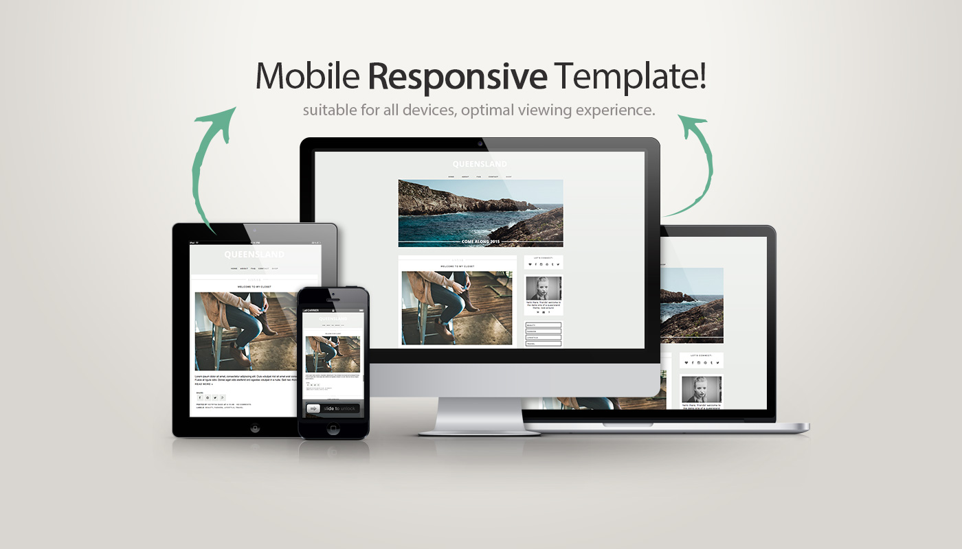
With more and more people using their phones and tablets to read blogs these days, it’s crucially important to consider having a responsive mobile template set up for your blog. As of April 21, there are more mobile-friendly websites in your search results. Google Webmasters write, “…we will be expanding our use of mobile-friendliness as a ranking signal. This change will affect mobile searches in all languages worldwide and will have a significant impact in our search results. Consequently, users will find it easier to get relevant, high-quality search results that are optimised for their devices”. This meaning- if your site is not suited for mobile sites, your SEO score can drop rapidly, make sure to check the blog design before purchasing or contact the seller for responsive update :)
 Fonts and Colours
Good blog design shouldn’t distract your readers from your content. Make sure to use clear, readable fonts, preferably in dark colour, consider increasing the spacing between lines too. Your readers want to actually be able to read, so if you pick a funky handwritten font for your posts, they will most likely struggle to stay concentrated. Classic fonts such as Arial or Helvetica work best, so consider sticking to them. As per colours, I personally like black & white designs best, but if you’re thinking of bringing a colour into your design- you definitely should. Make sure to stick to something light tho. I know that bright orange shade looks awesome as your lipstick, but it might look a bit too intense on the web. Check out Design Seeds for colour inspirations!
Images
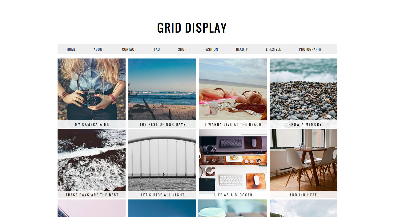
From where I stand- images are as important as text on the blog. I personally mostly never get back to blogs that have small, low-quality images, so if you believe in the importance of visuals- you should make sure your new blog design allows you to post large images and they fit the post area fully. You can also find some grid style themes if you love displaying as many images on the homepage as possible!
Hope you enjoyed this post, friends!
Don’t forget to get in touch if you need any help with your blog, visit my SHOP & look around :)
If you’re in need of custom domain name + hosting too, I could highly recommend Bluehost. They have the best customer service and would be happy to guide you through all the setup process!

How to Pick the Best Blog Design?
I am Kotryna Bass & I've tested most of the ways to make money online, so you wouldn't have to.
Back in 2012, I began my journey of selling digital products online. Since then, I have created several design and education brands using my personal websites and ETSY. I also started an e-commerce brand from scratch, reaching 500k in revenue. Through this experience, I learned all the tricks of marketing niche products online and making a profit without feeling overwhelmed. Let me show you what I've learned!
About Kotryna:
I am a digital products seller with over 10 years of experience! They have built multiple design and education brands, as well as a successful 7-figure e-commerce business from scratch. Get ready to learn from their wealth of knowledge in online marketing and profit-making.
LEARN MORE

Comments will load here